
WHY and HOW, an introduction to my work
Visual art can never be wholly captured in words. This introduction is merely a means to a better understanding of my work.
WHY
My work revolves around the mystery in everything I see and experience on this small planet, a glittering jewel in the immeasurable, cold, dark universe. As I consider man to be just a fleeting element in the whole, it is inevitable that I turn to sand and stone, water and mountains, the wind and the stars as bases for my work. To find an answer to the enigma of our existence is not my intention, but I do ponder on it and measure my thoughts against my observations and experiences.
Landscape
Landscapes, in the broadest sense of the word, are fundamental for my work deserts, mountains, rocks and rivers, but also urban environments and city-fringes. Seemingly arbitrarily I sought and seek different landscapes to inspire me, to order my thoughts, to look up at the skies and consequently to get on with my work. My main sources of inspiration are the following:
- the Yorkshire Dales and the west coast of Scotland, including the Inner and Outer Hebrides
- Australia, from the 1980s until 2000, specifically the deserts and wild northern regions
- the polders of Zeeuws Vlaanderen (Flanders) and the River Scheldt, regularly from 1965 until 2000. This part of the Netherlands, where I lived and worked for so many years, is a measure for all other landscapes I experience
- in 2002 the seemingly endless emptiness of Mongolia and a first acquaintance with China
- in 2004 northern and western China, seen from slow overland trains
- in 2007 Xinjiang Province, northwest China, particularly the vast barren Taklamakan Desert and its surroundings, bordered by the northern and southern Silk Roads
- western China once more in 2011 desolate Qinghai Province with its enormous Qinghai Hu (lake)
- in 2010 the northernmost coast of Norway and in 2013, Jan Mayen Island and Spitsbergen.
Literature, music and the visual arts
Besides landscapes, whether chosen or discovered, literature, music and the visual arts stimulate my emotions and thoughts. Reading and re-reading of Franz Kafka, Albert Camus, Witlod Gombrwicz and W.G Sebald guide my thinking, and soon after the first visit to China in 2002, I became absorbed in the writings of Lao Zi and Zhuang Zi, which have enhanced my life. The poets Wallace Stevens, Pessoa, Brodsky and Nijhoff continue to fascinate me as does the work of Mustafa Stitou, an exponent of the younger generation.
I enjoy a wide variety of music but the following composers are my favourites when working in the studio Haydn and Beethoven, especially their string quartets, Janaçek, Poulenc, Sjostakowisj and Schnittke, as well as Goubaidoelina, Pärt and Oestwolskaya, and Thelonius Monk, the great jazz composer.
The visual arts: I find Romanesque art deeply moving with its clear and explicit expression, as well as its equality of figuration and abstraction which is totally captivating. Many centuries later this equality was nullified by Colin Renfrew in what he described as The terror of the Renaissance*, that is, the compelling supremacy of realism, but this in no way interferes with my profound enjoyment of works by Giotto, Pierro della Francesca, Ucello and many others. From the succeeding centuries, just a few names Hercules Seghers, Velazquez and Philips Koninck. When in museums I always look for the latters work because of the delightful typically Dutch landscapes, often enhanced by alienating elements. From the 19th and 20th centuries, once again only a few names Henri Matisse and Edward Munch (specifically the landscapes). When younger I was strongly influenced by the so-called New Figuration and Raveels work continues to intrigue me; when in Copenhagen I was impressed by Per Kirkebys art.
* Colin Renfrew: Figuring it out, chapter 2; Thames & Hudson, 2003


HOW - techniques
Graphics *
The study of graphic arts at what was later to become the Gerrit Rietveld Academy greatly influenced my work for years to come , also my painting and drawing. From the start I had a preference for the silkscreen technique, only sporadically using gouges and linoleum, as is still the case. For financial reasons and lack of space it was not possible to acquire my own silkscreen apparatus so I worked together with skilful printers, such as Rolf Henderson (from 1973), intervening where necessary and mixing my own colours. In the 1980s master printer Chris Prater of Kelpra Studios**, London, produced my silkscreen prints. From the late 1980s on, Bernard Ruigrok in Amsterdam, gifted printer and coach, was prepared to work with me, in 2000 introducing me to piëzography as an alternative to silkscreen printing.
The artists books/bibliophile books originate and are motivated in a different way to my graphic work. The books, bound or as loose-leaf sets of prints in cassette or folio, mostly have a literary background, such as those based on Franz Kafkas diaries or poetry by Wallace Stevens, W.S. Graham and Richard Pietrass. In other books, such as Elements and Water, text fragments from work by various authors have been used. Other editions such as Notes on 50 years, commissioned in 1985, Borders and Transitions from 1981/83 and Undestinedfrom 1995/96, have a non-literary background.
Many of the mentioned publications were produced by Atalanta Pers, others by my own Derby Pier Publishers. The techniques applied are concurrent with my other graphic work first silkscreen, then sporadic lino-cuts, and since 2000 piëzography.
* All prints and books are in the collection of the Rijksmuseum Amsterdam
** All prints from the London period are in the collection of the Tate Gallery London
Drawing
Until 1988 drawings were made irregularly and not as an independent form of expression. They were more like first drafts for silkscreen prints and paintings because this work displayed strict line-patterns and organization. Gradually, drawings in their own right began to appear, often coloured-in and still strictly stylized. In 1987, on my first trip to Australia, the landscapes, the desert fringes, the coasts and the rocks, made such an impression that it changed my way of drawing completely. The change was a rapid one as is obvious in my travel sketches these are spontaneous and straightforward. The technical drawing pen was replaced by the brush and sometimes chalk, and smooth water colour paper by mulberry paper.
Lately the drawings are in black Chinese ink, some with a little colour , invariably becoming aquarelles, making it difficult, at times, to distinguish between a brush drawing and an aquarelle.
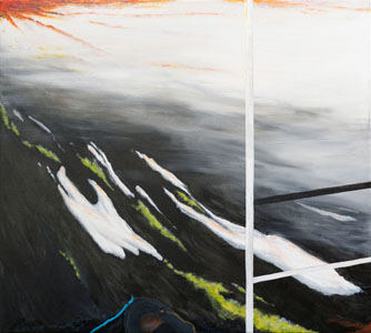
Painting
As a result of my schooling, as mentioned above, the graphic arts predominated in my early years as an artist and this was very obvious in my paintings, but my first confrontation with the Australian landscape in 1987 brought about a distinct change. Painting and drawing became more disparate (see on this website About drawing and painting). My earliest paintings consisted of sharply outlined colour segments, firstly in oils, then on a caparol base and later in acryl. Visible brushstrokes and any sign of emotion were to be avoided. My underlying feelings of doubt remained but my approach became more unconstrained, the brushstrokes became visible and the colours no longer stayed within the lines and gradually oils took the place of acryl. However, as in all the foregoing years, the landscape was and still is my source of inspiration.
Hans Landsaat, January 2014